Work
Brand identity for CUBE
The project
In 2016, after years of decline, the French music market took a turn for the better: revenues from music production increased (+3.9%). The music was saved. In fact, this increase came mainly from the "digital" part of the industry and the physical part continued to decline (-4.7% in the same year).
The agency behind the CUBE projet, RCA Factory, believes strongly in the link between real life and digital and in the influence of these two worlds (which are actually one) on each other. As true music lovers, they are convinced that the Parisian scene is full of talent. Finally, they believe that the music industry will continue its metamorphosis thanks to new technologies.
With these convictions in mind, they created the CUBE concept.
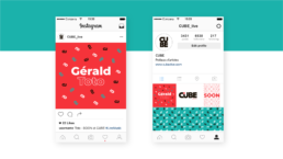
CUBE are intimate evenings that invite well-known local musical talents. These shows are streamed live on social networks via professional video production.
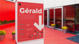
The particularity of these events is that they are always linked to a concert date of the artist performing on it. The goal? Promote the concert by giving a preview of the concert.CUBE evenings are like live concert business cards. They are a tool to boost ticket sales by giving a "preview" of the concert.
The video of the event is being published as a replay, it is then transformed into promotional material.
The work
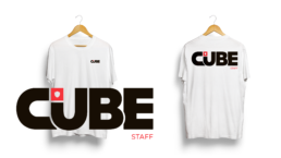
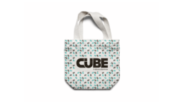
I was in charge of creating a graphic identity for the brand: a name, a logo, colors, a typography and some elements of brand differentiation.
The name
Why CUBE ? Several elements of this project have one thing in common:
- These are live broadcasts and when we film we do it in a square/rectangular format
- The lives will take place in a square/cubic room
- There is limited access to these events, a VIP/exclusive side - and what are VIP spaces called? The VIP squares!
So why not just call it CUBE?
What I was aiming for
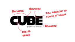
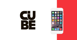
For this project, my main objective was to offer a flexible graphic identity that could easily be adapted to different media and that would differentiate in its market.
Indeed, the direct competitors of the project are almost all in the same register: serious, elitist, severe. I wanted to propose something more creative, open and accessible. I tried doing that with rounded elements and playful colors.
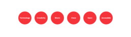
Key words
Logo explorations
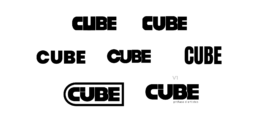
Logo refinement
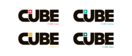
Final logo
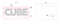
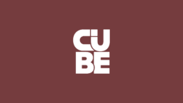
Logo balance
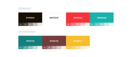
Color palette
Dynamic variations of the logo
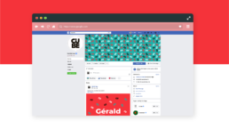
One of the challenges of this project was to have a flexible graphic identity that could be applied to several media and in different contexts. That's why I decided to propose a logo that adapts dynamically to the environment in which it is used.
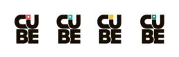
Logo favicon
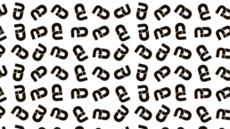
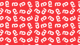
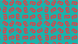
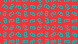
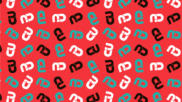
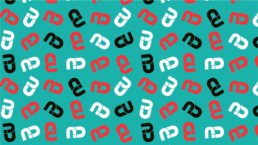
Patterns
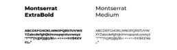
Typography