Work
Logo design for the Jinga Media company
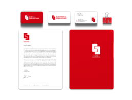
How to maintain consistency when creating a logo for a brand with two entities? That's the problem I tried to solve for the Jinga Media company (Trax Magazine).
The aim of the project was to deliver two logotypes with a common principle. They had to be very similar so that you would be able to tell they were from the same company.
The idea
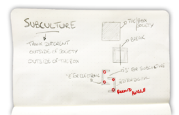
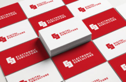
The idea behind this logo is the saying "Think outside the box" which directly comes from Electronic and Digital subculture's company values. I literally took that and divided a box in two parts. Those two parts form either an E (Electronic) or a D (Digital) and combined together they form an S (Subculture).